
It’s been 10 years since I printed and cut my first set of stationery, 7 years since I launched the first version of lotusandash.com (a blog), and 2 since I launched this version of the site. It’s also been a week since I made one of the biggest decisions in my life so far — one that is sure to see a lot more paper and design from LOTUS&ASH come into the world. I’m excited. Very excited.
2015 is going to be a good one - there's a lot of work to be done - and I’ll keep you posted here as the adventure unfolds.
For now, here’s a look back at 2014 – a journey that included the pleasure of working with a record of eight (8!) couples on their wedding paper suites, a paper journey to Japan, and continuing to work with the most passionate small business owners.
- some highlights -
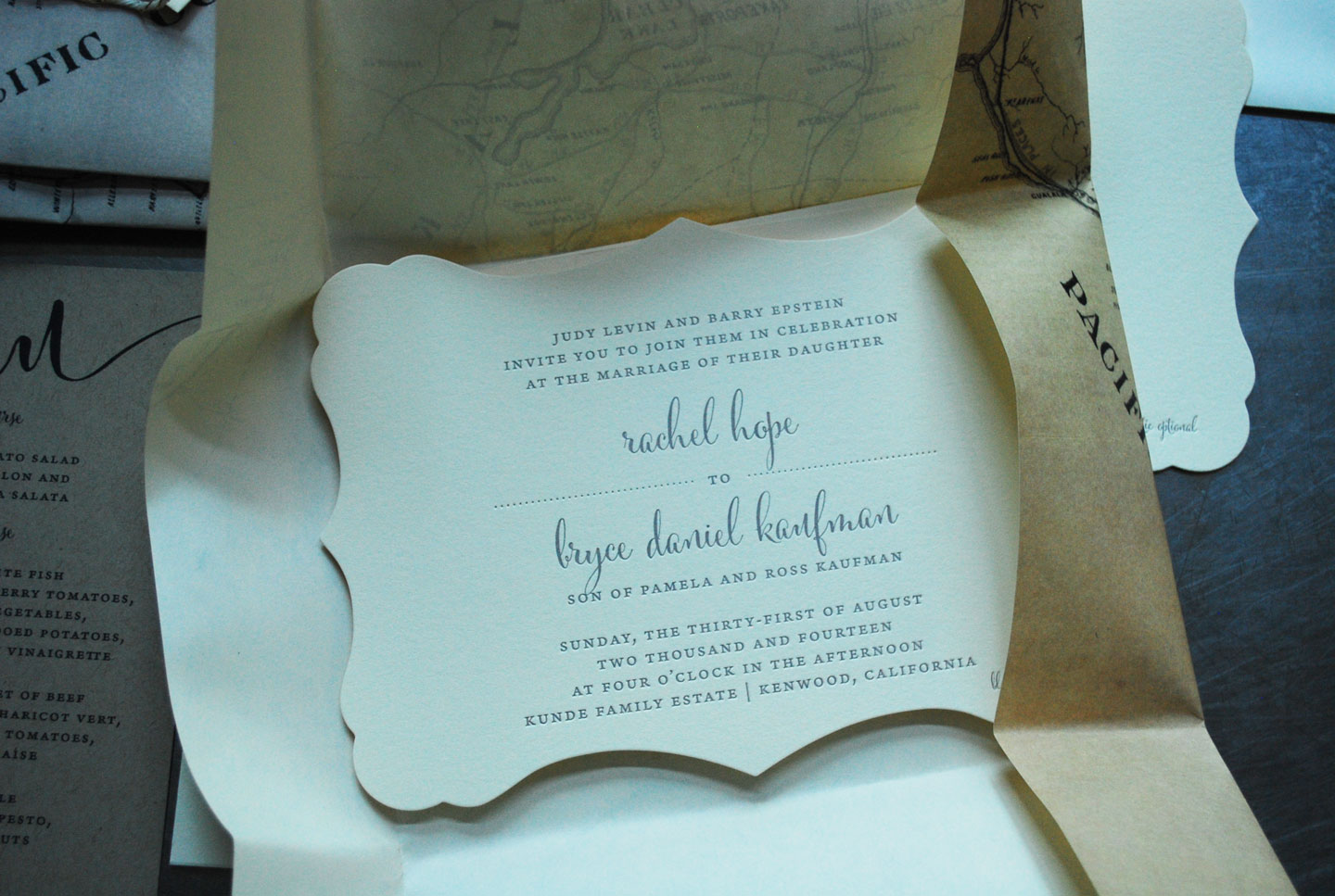
map-wrapped letterpress invitations for a sonoma wedding

incorporating watercolor into this “desert meets san francisco” chic wedding


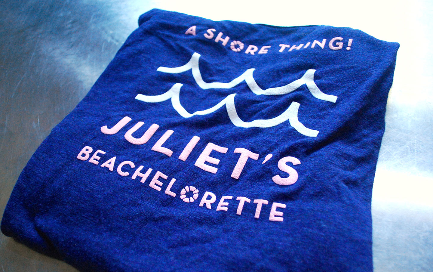
planning a “beachelorette” and designing the wedding paper suite for one of my closest and dearest friends


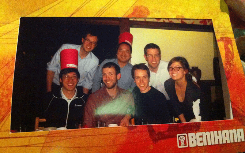
completing the projects for 8 weddings at the end of summer

… and celebrating with a trip to ojai

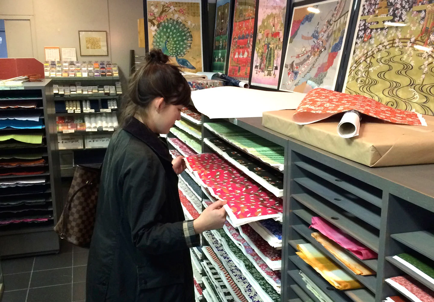
visiting morita washi paper in kyoto
exploring naoshima and solo time with yayoi kusama’s pumpkin and monet’s lillies


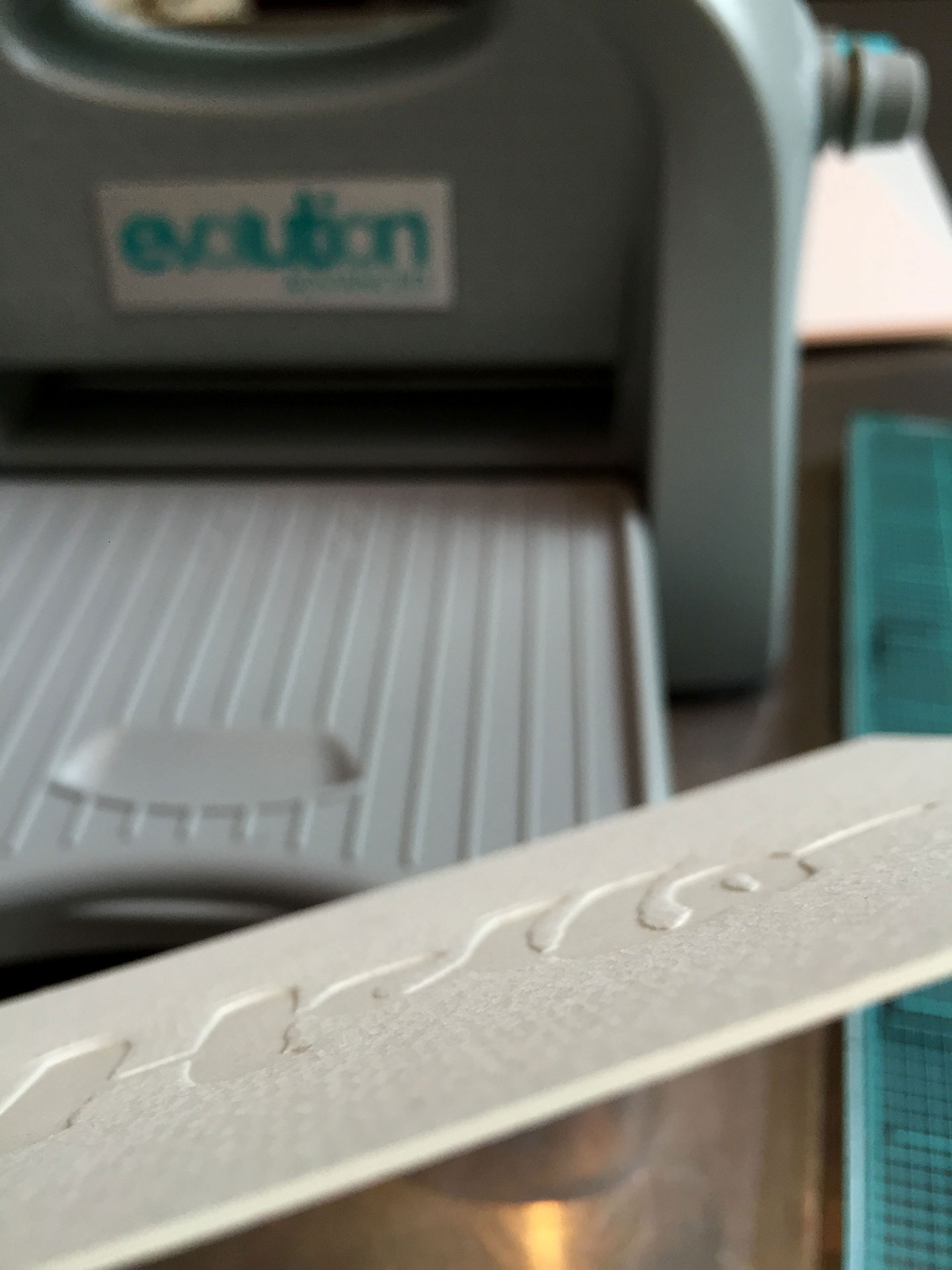
the first print with my evolution press … and the promise of using a real press in 2015
These are just a few of the things that have made 2014 memorable — and, safe to say, the best yet. 2015, here we come.


 her bubbly to his beer
 her stanford to his cal
 her salty to his sweet
 the jackie to his jfk
 her pumps to his loafers
 design spotlight: the wedding invitation suite of tess & kieran


 …page two highlighted the weekend events


 (photo by anna page photography)


